Ui Ux Design: A Practical Guide for Websites, Apps, and SaaS Products
ui ux design combines the design of an interface with the design of the experience around it. For a business website, SaaS platform, mobile app, dashboard, or AI-enabled product, the practical goal is to help the right user complete the right task with less confusion, effort, and risk. UI concerns what people see and manipulate; UX covers the wider journey, including research, information architecture, workflows, content, accessibility, feedback, and improvement after launch.
What UI and UX design actually cover
UI and UX are related disciplines, but they solve different parts of the same product problem. Treating them as interchangeable can produce an attractive interface that does not help users accomplish meaningful work.
UI design is the visible and interactive layer
UI design defines how a digital product communicates visually and responds to input. It includes layout, typography, colour, spacing, icons, buttons, forms, navigation, responsive states, motion, and error messages. A UI designer decides, for example, whether a primary action should be a filled button, where it belongs on a mobile screen, and how it changes after a user taps it.
A good interface is not merely decorative. Visual hierarchy tells users what matters first. Consistent components reduce the number of interface rules they must learn. Clear labels make actions predictable. States such as loading, empty, disabled, success, and failure prevent the product from appearing broken.
UX design connects user needs to product behaviour
UX design concerns the complete experience before, during, and after an interaction. It asks who the user is, what they are trying to achieve, what information they need, what constraints they face, and what the system must do next.
For a B2B dashboard, UX may involve deciding whether an administrator should invite a team member before configuring permissions, how an approval process should work, and which metrics belong on the first screen. For an AI feature, UX also defines how users provide context, review generated output, correct errors, and understand when the system is uncertain.
Common UX outputs include:
- User journeys showing how a person moves from a need to a completed outcome.
- Information architecture that groups content, features, and navigation in a comprehensible way.
- Wireframes and prototypes used to resolve workflow questions before engineering begins.
- Interaction rules for validation, permissions, loading, errors, confirmations, and recovery.
- Usability findings that identify where users hesitate, misunderstand, or abandon a task.
The boundary is useful, but the work should remain connected. A UX decision to shorten a checkout flow affects the UI. A UI decision to hide an important status behind an icon affects the UX. Product teams should therefore review both visual clarity and task completion, rather than approving screens in isolation.
Why Ui Ux Design matters to business performance
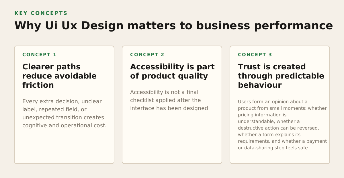
Design is most valuable when it reduces a measurable business or operational problem. A redesign should not begin with “make it more modern.” It should begin with a question such as: Why are qualified visitors failing to request a quote? Why do customers contact support to complete a routine task? Why do employees bypass an internal tool and return to spreadsheets?
Clearer paths reduce avoidable friction
Every extra decision, unclear label, repeated field, or unexpected transition creates cognitive and operational cost. A well-designed flow makes the next action visible, preserves context, and gives the user useful feedback. This is particularly important for SaaS products, where users may perform the same workflow every day.
Consider a service company website. If visitors must search through several pages to determine whether the company serves their industry, where it operates, and how to start a project, the problem is not necessarily the visual style. The problem may be information architecture and content hierarchy. UX work would make those questions explicit, then UI design would give the answers a prominent and scannable presentation.
Accessibility is part of product quality
Accessibility is not a final checklist applied after the interface has been designed. Keyboard access, text alternatives, colour contrast, focus visibility, readable structure, and understandable form errors influence how many people can use the product successfully. The W3C’s Web Content Accessibility Guidelines provide an internationally used framework for making web content more perceivable, operable, understandable, and robust.
Accessible design also improves resilience for users working on small screens, in bright environments, with slow connections, temporary injuries, or unfamiliar language. For an employee dashboard, descriptive labels and logical keyboard order can make routine work more reliable even when accessibility is not the stated project goal.
Trust is created through predictable behaviour
Users form an opinion about a product from small moments: whether pricing information is understandable, whether a destructive action can be reversed, whether a form explains its requirements, and whether a payment or data-sharing step feels safe. Trust is weakened when the interface hides important consequences or changes behaviour without explanation.
For an AI-enabled application, the interface should distinguish generated suggestions from confirmed facts and make review possible before an external action occurs. The design should also show what data is being used when that information affects the result. A polished chatbot that provides no route to correct, edit, or verify its output is a UX risk, not simply a visual opportunity.
Concrete design objectives can be expressed as project hypotheses. The numbers below are illustrative starting policies, not universal benchmarks:
- Reduce a quote-request form from 12 fields to 7 by removing information that sales can collect later.
- Help a new SaaS administrator complete workspace setup in 5 deliberate steps instead of 9 disconnected screens.
- Make the primary task available within 2 navigation levels for a frequently used internal dashboard.
- Test 3 competing labels for a confusing workflow before committing the terminology to the product.
These targets become useful only when paired with a measurement method: completion rate, time on task, support requests, activation, qualified leads, error frequency, or another outcome tied to the product’s purpose.
How a professional Ui Ux Design process works
A reliable process turns uncertainty into decisions in stages. It does not mean producing a large set of documents before anyone sees the interface. It means investigating the highest-risk assumptions early, then increasing design detail as the direction becomes more credible.
1. Start with goals, users, and constraints
The first step is to align the team on the business outcome and the users who matter for that outcome. A redesign for lead generation has different priorities from a workflow tool for trained staff. A mobile app used in the field may need larger touch targets and offline-friendly states. A regulated or permission-heavy dashboard may need a stronger focus on roles, auditability, and error prevention.
Useful inputs include analytics, customer-support conversations, sales objections, stakeholder interviews, existing product data, technical constraints, and competitor or alternative workflows. The purpose is not to copy another product. It is to identify user expectations and opportunities to differentiate.
At this stage, document:
- Primary user groups and the job each group needs to complete.
- Business outcomes that indicate whether the design is helping.
- Known constraints such as integrations, permissions, content, devices, deadlines, and legacy code.
- Risks that could invalidate the concept, such as missing data, unclear ownership, or an unproven AI capability.
2. Map the journey and information architecture
Next, describe the route from trigger to outcome. For a web application, this may include registration, onboarding, first value, recurring use, billing, collaboration, and support. Mapping the route exposes unnecessary steps and reveals where the interface must explain a decision.
Information architecture then determines what belongs together and how users locate it. Navigation should follow user expectations and product priorities, not the company’s internal department structure. “Solutions,” “Resources,” and “Company” may make sense to an organisation, while a customer may be looking for “pricing,” “implementation,” or “support.”
3. Prototype the risky parts before building them
Wireframes are useful when the main questions concern structure and sequence. Higher-fidelity prototypes are appropriate when visual hierarchy, responsive behaviour, motion, or stakeholder confidence is the risk. The prototype should represent the critical path, not every possible screen.
Usability evaluation can be lightweight and focused. Give representative participants a realistic task, observe where they hesitate, and ask what they expected to happen. Do not lead them toward the intended answer. Findings should be converted into decisions, such as changing a label, moving an action, exposing a status, or removing a step.
Design systems make approved decisions reusable. A component library should define not only the default button or input, but also its error, focus, loading, disabled, mobile, and permission-related states. For implementation, this creates a shared contract between design and frontend development.
4. Specify behaviour for engineering
A handoff that contains only static screens leaves too many important questions unanswered. Developers need to know what happens when data is missing, a request fails, a user lacks permission, or a connection is interrupted.
- Define the normal state and the user’s intended next action.
- Define validation rules, including when errors appear and how they are corrected.
- Define loading, empty, success, failure, and retry states.
- Define responsive changes across the supported viewport and device range.
- Record accessibility expectations, content rules, analytics events, and open questions.
For web projects, performance belongs in the design conversation. The web.dev documentation explains Core Web Vitals as user-focused measures covering loading, interactivity, and visual stability; teams can use that framework to discuss performance as an experience requirement rather than a late engineering concern (web.dev: Web Vitals).
Where Ui Ux Design commonly breaks down
Most weak outcomes do not come from a lack of visual skill. They come from solving the wrong problem, hiding uncertainty, or separating design from implementation until late in the project.
Starting with screens instead of decisions
Jumping directly into polished screens encourages stakeholders to debate colours and spacing before agreeing on the workflow. It also makes structural changes feel expensive. Begin with a small number of critical journeys and use low-fidelity artefacts to settle the sequence first.
Designing for the buyer while ignoring the operator
A marketing website may be approved by an executive but used by prospective customers. An internal platform may be purchased by a manager but used daily by staff. These groups have different goals and tolerance for friction. Include the people who perform the work, not only the people who sign off the project.
Underestimating edge cases
A happy-path prototype can make a product look simple because it omits the conditions that create most support requests. During design, explicitly cover:
- Empty states when a new account has no data.
- Long names, large numbers, translations, and content that does not fit the initial layout.
- Slow networks, expired sessions, failed uploads, and interrupted payments.
- Permission differences between owners, editors, reviewers, and read-only users.
- Undo, cancellation, deletion, and recovery after a consequential action.
Another frequent failure is treating accessibility as a visual contrast exercise only. Colour choices matter, but so do heading structure, focus order, control names, error association, keyboard operation, and meaningful feedback. The Apple Human Interface Guidelines accessibility guidance and the Material Design accessibility guidance both illustrate why platform conventions and inclusive interaction patterns should influence product decisions.
Ignoring the technical system
Design can promise a workflow the backend cannot support efficiently, or a component can be visually consistent while being difficult to maintain across the product. Bring frontend and backend developers into decisions about data availability, API latency, permissions, responsive constraints, component reuse, and analytics.
For example, a dashboard filter that looks simple may require a clear definition of date ranges, time zones, saved views, empty results, and server-side pagination. Resolving those rules before development is cheaper than discovering them through repeated rework.
How to apply Ui Ux Design to different product types
The right emphasis changes with the product. A brochure website, mobile workflow, SaaS platform, and operational dashboard should not share the same discovery assumptions or success criteria.
| Product type | Primary design question | Important design focus |
|---|---|---|
| Business website | Can the right visitor understand the offer and take the next step? | Positioning, content hierarchy, trust signals, responsive layouts, forms, and search visibility. |
| SaaS platform | Can users reach first value and repeat core workflows? | Onboarding, navigation, permissions, empty states, billing, collaboration, and reusable components. |
| Mobile application | Can users complete the task in the context where the app is used? | Touch interaction, permissions, notifications, connectivity, platform conventions, and concise flows. |
| Business dashboard | Can an operator understand status and act without losing context? | Information density, filtering, tables, roles, alerts, exports, audit trails, and error recovery. |
| AI-enabled product | Can users direct, evaluate, and safely correct automated output? | Input guidance, source or context visibility, uncertainty, approval steps, editing, and fallback paths. |
For websites and redesigns
Start with the customer’s decision process, not the sitemap alone. Identify the questions a prospective customer must answer: Is this relevant to my organisation? Can this team deliver the work? What will happen next? What evidence supports the claim? A focused content model and clear calls to action usually matter more than adding visual effects.
For companies planning izrada web stranica u Zagrebu, the design brief should connect local market context, service positioning, content production, SEO requirements, and the technical platform rather than treating design as a separate stage. A related visual reference point is web dizajn Zagreb, but the useful deliverable is a tested structure that supports the organisation’s commercial goals.
For SaaS and custom software
Design the recurring workflow before polishing the marketing page. Define the first valuable action, the data required to complete it, and how the product communicates progress. Pay special attention to onboarding and permissions: users should understand what they can do, what is expected of them, and why an action is unavailable.
For complex applications, a component-based design system can reduce inconsistency, but it should not force every workflow into the same template. Reuse visual and interaction rules where they help; make exceptions explicit where the user’s task genuinely differs.
For mobile apps and AI features
Mobile design must account for context: one-handed use, interruptions, device permissions, notifications, and connectivity. The smallest screen should not simply receive a compressed desktop layout. Prioritise the core action and move secondary detail into progressive disclosure.
AI features need an additional layer of UX responsibility. Explain what the feature does, guide users toward useful input, show the result in an editable form, and provide a safe path when the output is wrong or unavailable. Automation should reduce work without removing the user’s ability to inspect consequential decisions.
The strongest projects connect strategy, UX research, interface design, content, engineering, and measurement from the beginning. Adapt IT works across UI/UX, frontend and backend development, websites, mobile apps, SaaS products, and AI-enabled digital products. If you need a partner to turn a business workflow into a clear, buildable product, Adapt IT is a sensible next step.
Authored with NotFair SEO